
Interactive experiences and us
Stat 221, Lecture 24
Roadmap
- Is effective presentation important?
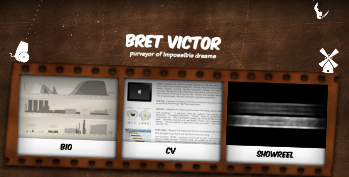
- Example: Bret Victor
- Does interactive visualization matter?
- Example: Anchor process
- Structuring perception, defining types of visualization
- Creating interactive experiences part of data analysis workflow and beyond
- Using reveal.js and other tools
Where we are
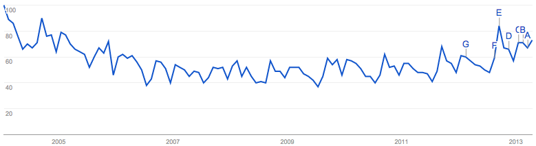
Google trends: data science vs statistics (which one is which?)
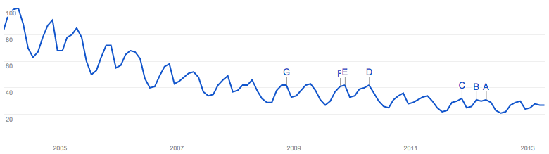
A million dollar question
- The substances of the two terms being so similar,
why is one of them so much more popular?
- Is it just marketing?
- Is there something much more attractive about one concept over the other?
- Why do we care about the answer?
Google trends: data visualization
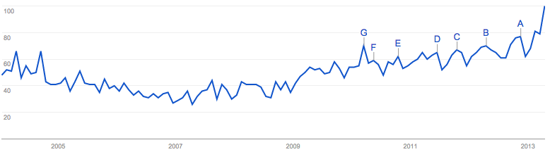
What do we do with the trends?

Is effective presentation important?
- Probably, yes
- Bret Victor (worrydream.com) - class activity
Tools to communicate effectively
- Soft skills
- Visual information
- Writing
- Visualization
- Other components?
Visualization can be different
Using interactive visualization
Use visualization to
- understand a problem
- tell other people how you did it
- convey information and persuade
- do art - provoking to think
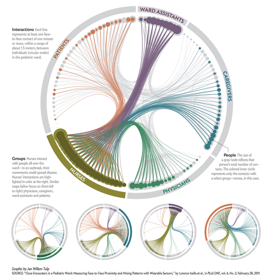
Distribution+network (with homophily)
Two variants of population networks
RDS with homophily
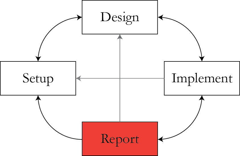
Anchor Process model
Model statement: $$\begin{align} Y_i \given Y_{r(i)} & \sim N \left(\rho Y_{r(i)} + (1 - \rho) \mu, (1 - \rho^2) \sigma^2 \right), \\Y_i & \sim N\left( \mu, \sigma^2 \right) \rr{ if } r(i)\rr{ doesn't exist}\end{align}$$
- \\( \{ \rho, \mu, \sigma^2 \} \\) is the parameter set
- \\( r(i) \\) is the index of referrer of respondent \\( i \\).
- \\( Y_i \\) is the observation of respondent \\( i \\).
- Needs more involved computation - there is no closed-form solution for \\( \hat{\mu} \\).
AP model simulation
A large variety
- All visualizations serve their purpose. But not all do it well.
- Visualization qualities vary:
- Signal-to-noise ratio if conveying information is varied.
- The balance of color/animation vs. helping the user make useful analogies is not always met.
- Sometimes, the makers of a visualization simply don't realize what targets they need to hit.
What are the main concepts that can serve as basis points when defining a visualization?
We need to understand and define them so that we can use visualization effectively.
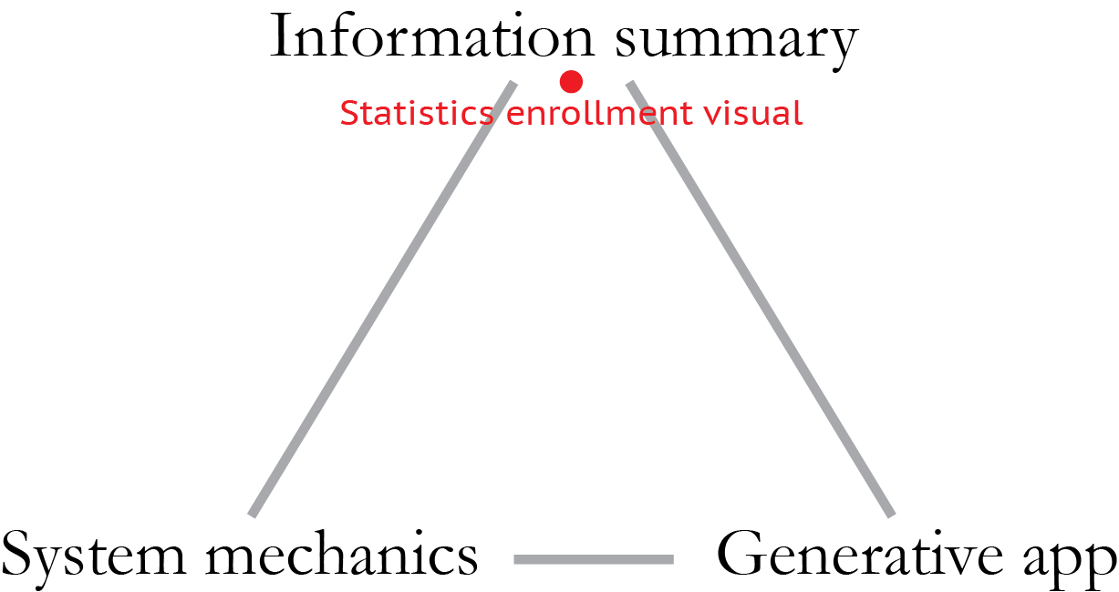
Visualization: defining traits
- The goal (convey a message, engage, entertain, perplex).
- The audience.
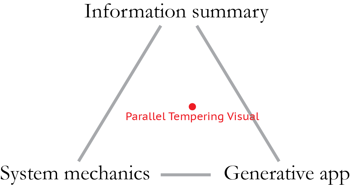
- Type (system mechanics, information summary, generative application)
- Technical qualities
- Ability to compare/build analogies - or the opposite
- Saturation with information
- Saturation with colors/shapes/animation
Tech qualities: example
Another example

Another example
Visualization type
Exercise: put PT visual on triangle

Classifying helps find visual's drawbacks
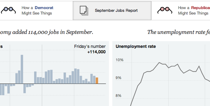
Comparison and analogies in visualization: NYT graphics example
An opinion on infovis
"Do you worry about data viz being used to misrepresent data? Sometimes visualizations can feel like "the answer" even if they're based on flimsy data."
Amanda Cox, NYT Graphics:
"...Coming from a statistics background, when I first got here I thought my big contribution would be to help us account for uncertainty in data viz and that turns out to be very difficult. But I also think we have the power to make people more data and visualization literate. ..."
Stat visualization
- Gelman: "Within statistics, exploratory and graphical methods represent a minor subfield and are not well- integrated with larger themes of modeling and inference. Outside of statistics, infographics (also called information visualization or Infovis) is huge, but their purveyors and enthusiasts appear largely to be uninterested in statistical principles."
- Gelman, Andrew, and Antony Unwin. "Infovis and Statistical Graphics: Different Goals, Different Looks." (2011).
Statistical visualization
Stat visualization
- Papers.
- Talks, quick research sketching.
- Teaching.
- Rarely display findings to the general public.
- Type: most often information summary.
- What is the audience? What is the goal?
Infovis + statistics
NBA scoring spots on the New York Times
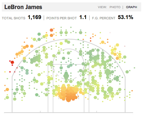
Let's map it here
Advanced statistical uses of infovis
- Non-parametric inference (with caveats).
- Powerful help in method design - system mechanics, model diagnostics.
- Generative app use - fitting nuisance parameters, or even complete models.
- Educational use.
Things to consider
Several aspects are important when creating a visualization:
- Goal. What are you trying to achieve with the project?
- Audience. Who are you trying to capture?
- Visualization type.
- Technical qualities: comparison/analogy, colors, shapes, transition speeds.
- The principle of parsimony.
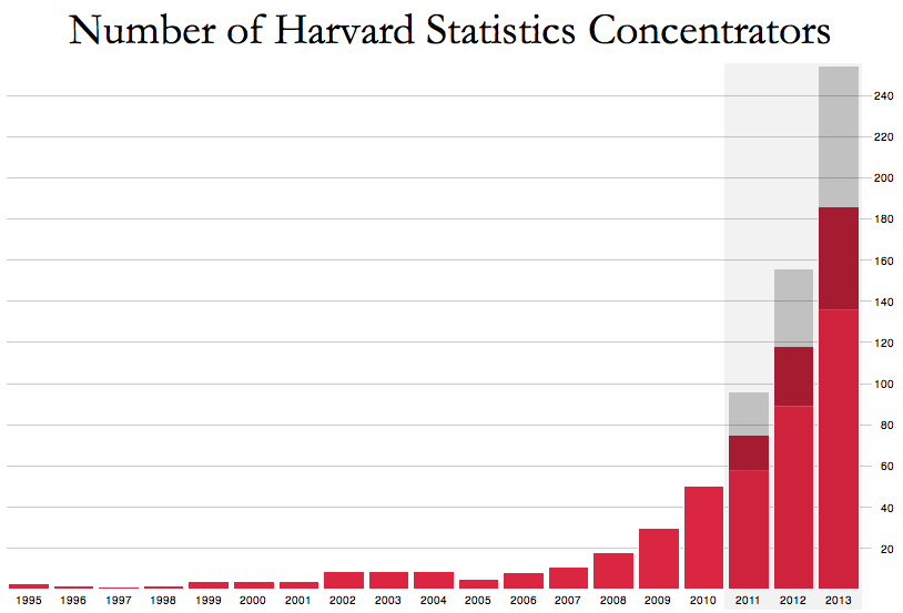
Process: stat concentration v1
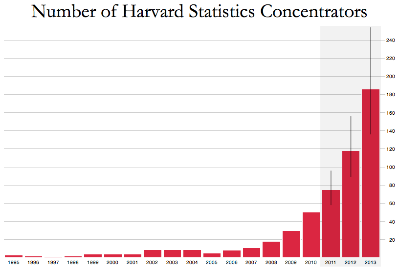
Stat concentration v2
Stat concentration v3
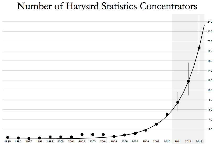
Classify it
But it's not perfect
Ways to improve
- Explain system mechanics more?
- Compare to growth in other stat fields?
- Let the user guess the next year's enrollment?
- Student suggestions
What should furhter improvements by guided by?
Tools to create interactive experiences
Yes, it's not just about visualization
- R (native, ggplot)
- Javascript (d3.js, Paper.js, Three.js, Processing.js, Raphael etc)
- Flash
- Java (Processing)
- C++ (Cinder)
Interactive experiences matter
Bringing interactivity to your presentations
- I use Reveal.js by Hakim El Hattab
- Together with Jade, Stylus
- What will you use?
Reveal.js
<div class="reveal">
  <div class="slides">
     <section>Single Horizontal Slide</section>
     <section>
        <section>Vertical Slide 1</section>
        <section>Vertical Slide 2</section>
     </section>
   </div>
</div>
Stylus
Less code to create CSS - compile .stylus to .css
border-radius()
  -webkit-border-radius arguments
  -moz-border-radius arguments
  border-radius arguments

body
  font 12px Helvetica, Arial, sans-serif

a.button
  border-radius(5px)
Jade
Less code to create HTML - compile .jade to .html
doctype 5
html(lang="en")
  head
    title= pageTitle
    script(type='text/javascript')
      if (foo) {
         bar()
      }
  body
    h1 Jade - node template engine
    #container
      if youAreUsingJade
        p You are amazing
      else
        p Get on it!
Put your visualizations directly into presentations
section
  h3 Exercise: put PT visual on triangle
  #pthmccontainer.viscontainer
    script(src='http://theory.info/media/vis/stat221pthmcalgo/jdriver.js?c=pthmccontainer&w=0.9&h=430')
Announcements
- T-shirts are here!!!
- Last T-shirt comp on till Wednesday
- Final project presentations May 8 at 1-4 in Emerson 305
- Everyone should watch everyone elses presentations
Resources
- Slides nesterko.com/lectures/stat221-2012/lecture24
- Class website theory.info/harvardstat221
- Class Piazza piazza.com/class#spring2013/stat221
- Class Twitter twitter.com/harvardstat221
Final slide
- Final lecture: what we have learned, and what we can do with it